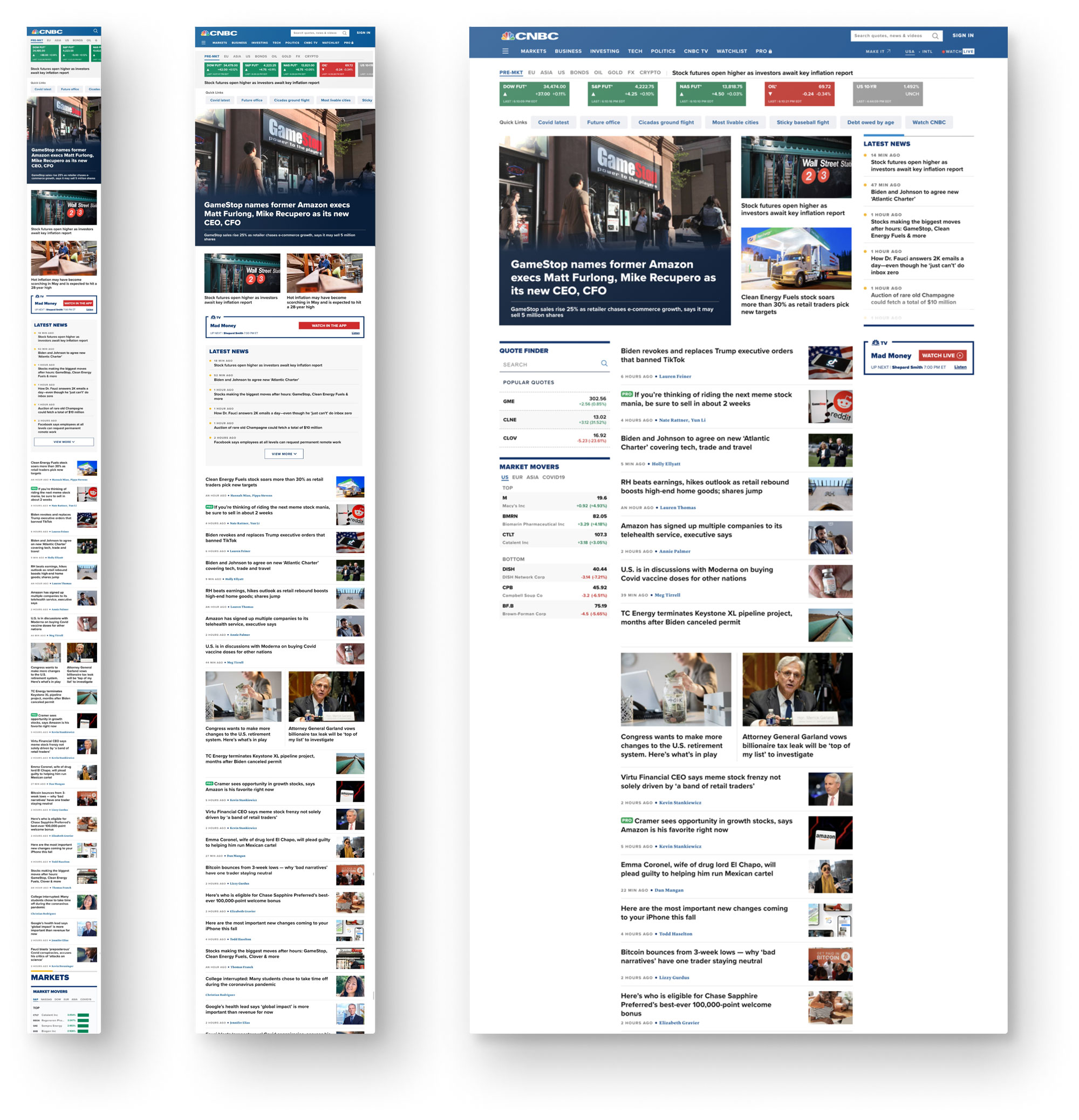
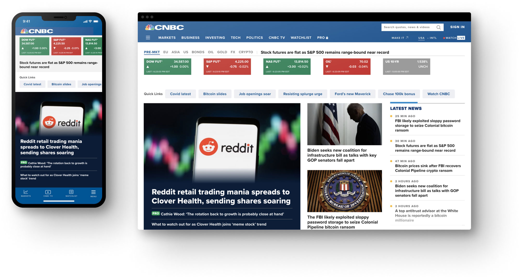
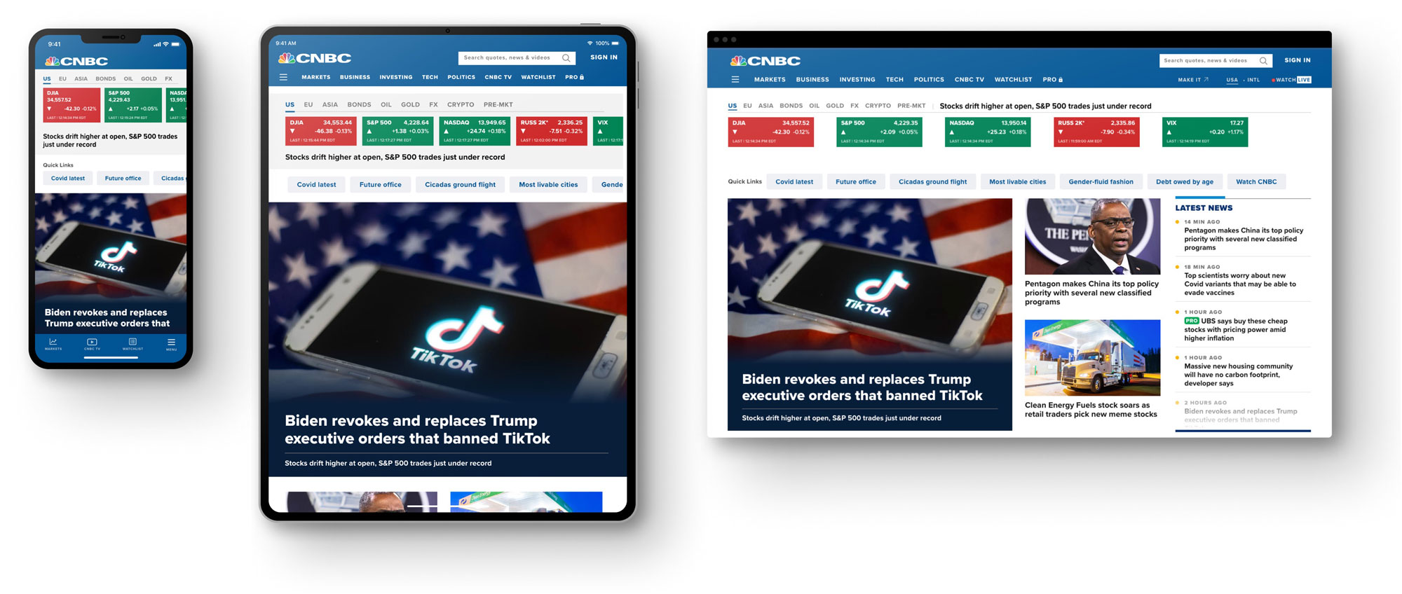
CNBC Homepage
Company:
CNBC
Role:
Product Design Lead
Collaborated with:
UX Designer
Product Manager
CX Manager
Tech Lead
QA Lead
Skills:
Design thinking
UX / UI
Context
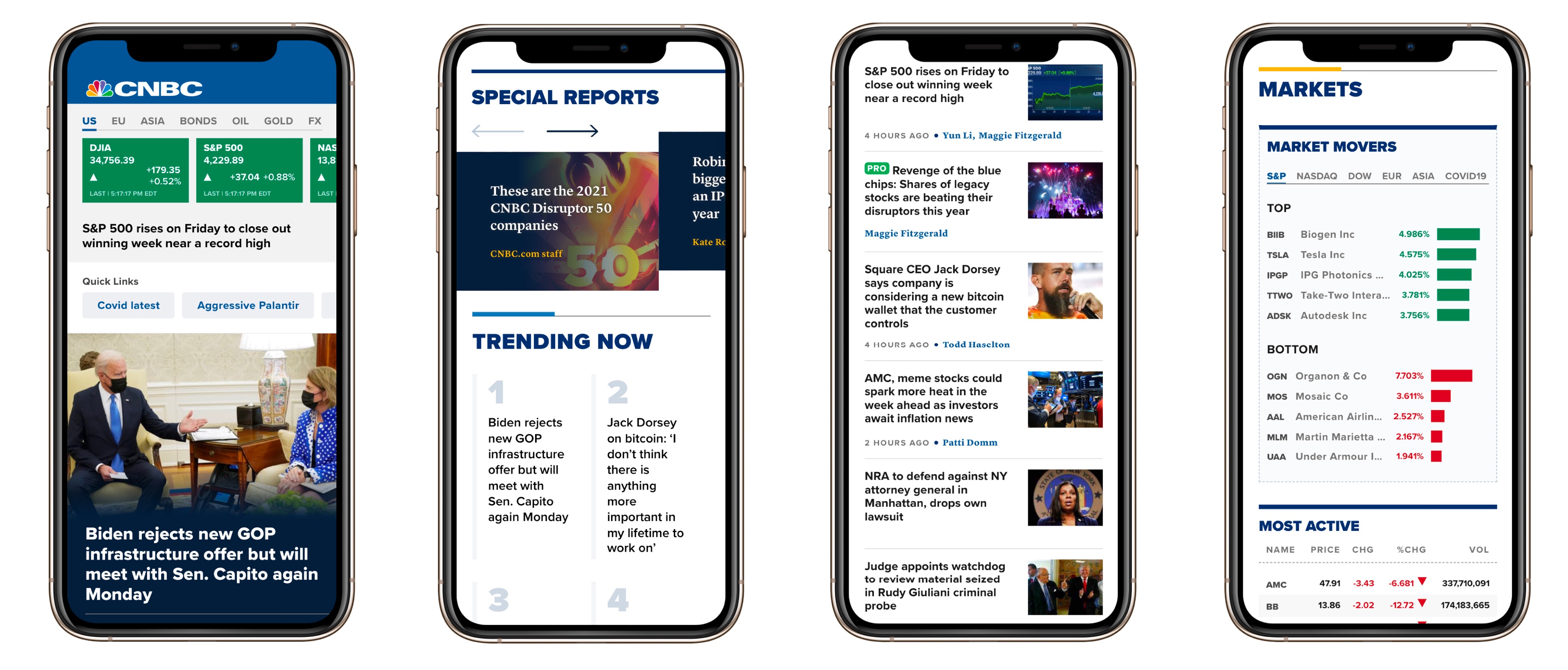
CNBC is the recognized world leader in business news and provides real-time financial market coverage and business content consumed by more than 355 million people per month across all platforms. CNBC’s website surfaces exclusive content published by their best in class editorial team. It became the go to destination for online financial and business news consumed by a loyal audience that keeps growing exponentially year after year. In order to offer the best possible user experience to its growing audience the site went through a complete redesign that included both frontend visual improvements and backend updates.
The problem
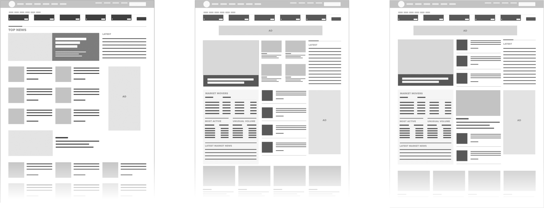
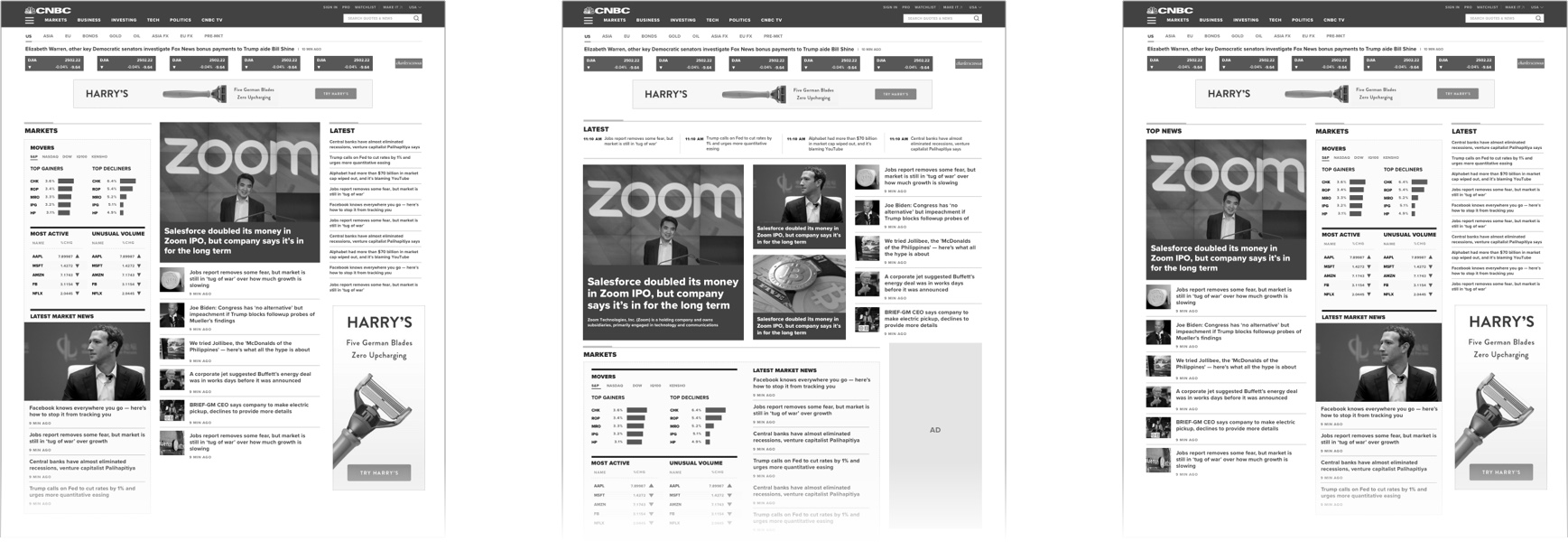
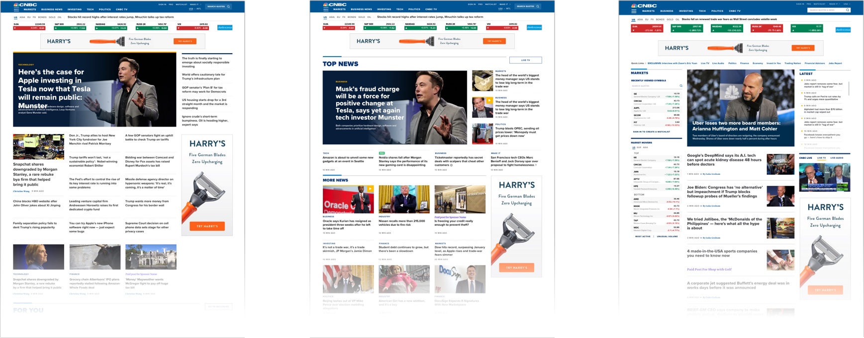
The new design was successful in many ways, however the new homepage design wasn’t well received by its loyal readers who were used to the previous experience, which was more dense and content heavy. The new homepage was harder to scan, required too much scrolling and pushed down a lot of the content that used to be readily available. Users had an overall sentiment that the new design made it hard to feel caught up with the news.
The goal
Design a new version of the homepage that alleviate the known pain points and keep users engaged with increased page views and return visits.
The solution
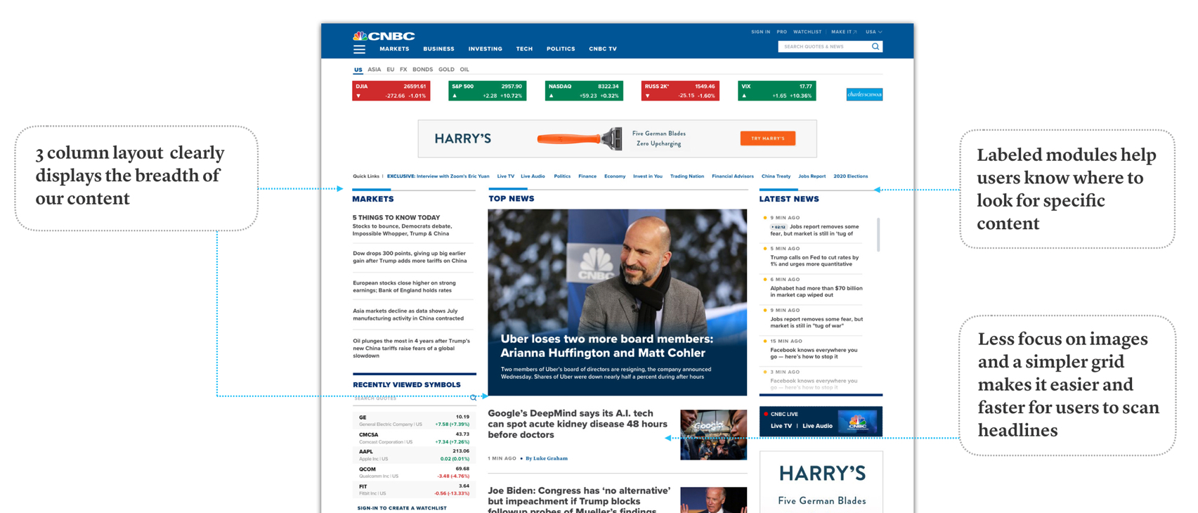
The new version of the homepage creates confidence in our users that they are able to get a good overview of the news each time they visit the homepage by:
- Increasing awareness of the breadth of content by allowing users to immediately see everything we cover
- Providing the ability to consume information faster by quickly scanning the content and headlines
- Allowing users to quickly find what they are looking for
Scope and constraints
- Design for all pre-defined breakpoints and exisitng grid.
- Adhere as much as possible to exiting patterns in the design system.
Design thinking tools:
The Process
1. Research
1.1 User interviews: we interviewed users to better understand their frustrations and needs while using the re-designed homepage. Through these interviews we uncovered many themes that aligned with what we heard from our Customer Experience team. The interviews also provided insights on user attitude, like their cadence and journey visiting the site, and what was working and not working to help them achieve their goals during each visit.
1.2 Desk Research: we did a deep dive into analytics to understand user behavior before and after the new design went live, and compared any insights with what we heard from users during our interviews. We also ran eye tracking tests to understand how users were scanning the headlines on the homepage and compare that to our qualitative research.
1.3 Synthesis:: key insights from the research were compiled into an infographic to be used as an artifact during ideation.
1.4 Customer feedback: worked with the Customer Success Manager to identify patterns in the user feedback and compare them with findings from our user interviews, this provided a good overview of users’ pain points and feature requests from current customers.
2. Ideation: We conducted several rounds of ideation sessions with different groups of stakeholders including design tech, product and editorial. Initial sessions were divergent and focused on blue sky ideation. The sessions gradually converged to very focused problem statements that led to shippable design solutions and eventually the new version of the homepage.
3. Prototyping
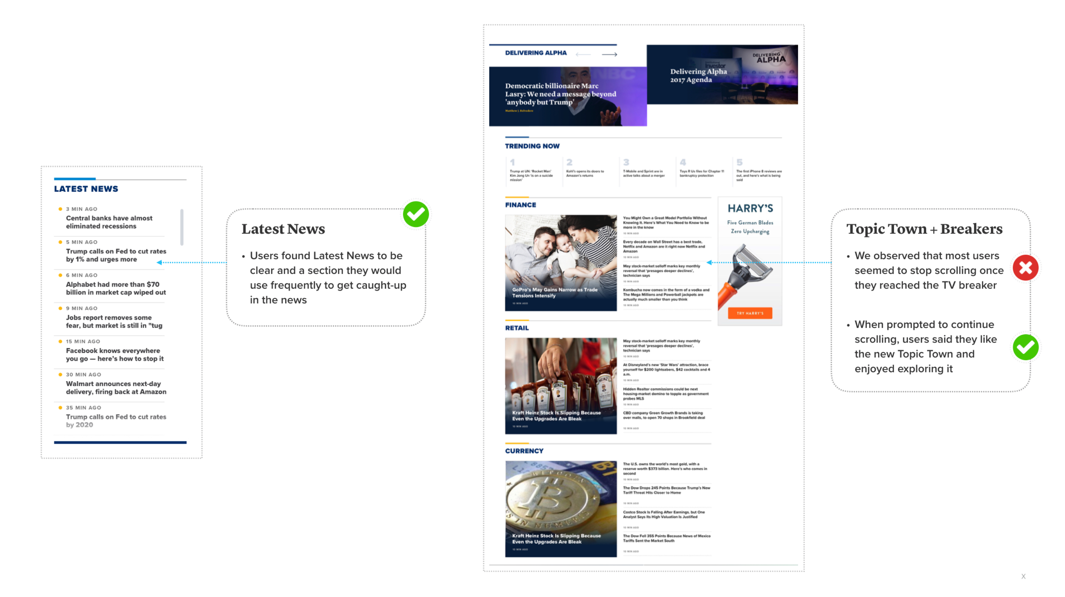
In preparation for our usability test I created a discussion guide outlining tasks that the user should be able to easily complete. Once the test tasks were defined I collaborated with engineers to create a functional prototype that was used in our test sessions. The prototype included the core functionality and states based on our vision for the final product.
Key feedback, insights and proposed iterations were documented in a UX report which was shared with stakeholders after each round of tests was completed.